
The logo for your business is — big surprise here — the lifeblood of your visual identity. I cannot overstate the importance of a well thought out, expertly designed logo. Once you get your why, your hows, and your whens… it’s time to focus on visual identity.
It should be one of the first things you and/or your team consider upon developing a branding strategy due to how closely it ties into every other facet, from your website’s layout and color palette to the business cards and merchandise/products you sell. It needs to be able to communicate to your demographic and audience for one, but you want it to stand out as unique among your competitors. You may think it’s an oxymoron to then say you should look for simplicity in your design, but not quite. I’m here to discuss what makes a good logo the best and what pitfalls you should avoid to ensure yours doesn’t belong with the bad.
why is logo design important?
You’ve seen it. I’ve seen it. We’ve all seen it. Major companies throughout the globe have announced revamped logos time and time again. Some are home runs, some are absolute dumpster fires. This type of rebranding can reinvigorate and save companies struggling to remain in the spotlight, while the more unwise design choices dig holes that can take several years to climb out of. Customers are known to identify with your logo more than your actual business name. Remove “McDonalds” from underneath their signs and you’re almost guaranteed to know who or what they are thanks to the famous golden arches forming a single ‘M’. A careful combination of colors, fonts, symbols, style and creativity can potentially yield your business more success than any other decision you can make.
How do you know if what you’re approving is going to be a hit or a giant fail? There’s always a degree of risk associated with the reveal of something creative, but there are ways of controlling and mitigating said risks so that your concerns can be alleviated. Good logo design is both memorable and simple. Connecting with your audience and making sure they can identify with your brand is a must, and the easiest way of establishing that connection is through your logo.
how to avoid the bad and ugly…
Let’s start with the easy. With enough ingenuity, you can make any creation successful, whether it’s a temporary logo to go with the holidays for an ad campaign or a logo meant for long-term implementation. More often than not, though, an unfortunate decision has been made during the creative process that results in a logo that is less than ideal. We’ll go ahead and talk about a few general “no-no’s” that you would be better avoiding altogether:
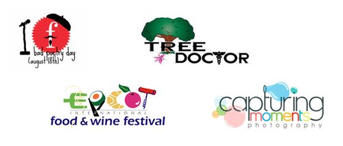
Examples of poor logo design.
-
Clashing colors and fonts
-
User and/or print-unfriendly
-
Poor spacing
-
Bad textures (image quality on print or rough edges on digital)
-
Busyness via shapes; out of place/overlapping elements
-
Too much information (don’t treat your logo as a business card, i.e. address underneath)
-
Easy-to-misinterpret design (don’t turn your logo into a meme!)
… and what to consider for the good.
So we’ve narrowly avoided the mistakes that could result in an instant-loss. Congratulations! Now we need to consider how to make your logo the cream of the crop. That’s where things get more complicated, but fortunately for us, your options broaden greatly as well. There are lots of considerations you should have in mind at any point in the creative process. Gut-punch impressions and naturally attractive looking brands are one thing, but you need to also ensure you are speaking to the ideal customer. Building a connection with someone is, as you might guess, difficult to create in such a short period of time.
Think about your normal day and consider how many ads you have seen. It could be a promotion on Facebook, television commercials or just driving past a billboard; chances are a logo was fixed in a location for you to see. Do any of them stick out to you? Do you vividly remember their logo? Does that help you remember their name, what they sell or why they were interesting to you? There is a good chance there are more you can’t put your finger on than not, and that’s because they missed the mark on bridging that connection between them and you.

Be clear and concise with your logo. If a potential customer can’t tell what you’re providing, you have some work to do. Beauty and attraction always helps, but like with dating, it’s about more than that! You need personality. You need a fresh, unique take that is difficult to find elsewhere. Show someone why they want to call you or visit their site, let alone spend their hard-earned money on you. Show why they deserve your trust.
Usability is also a must. There’s nothing worse than having a great logo in the works and finalized, only to find out a certain font or symbol doesn’t translate well on coffee mugs or t-shirts. You will need to consider how your logo will look both digitally and physically. It is traditional for more inexperienced designers to create a logo with only one type of file format like .jpg or .png, and in doing so, future edits to your logo may be more difficult.
Strive for simplicity. A common but important trend for businesses in recent years is rebranding to a logo that has been toned down and simplified. Trendy is not always what you want to seek out, but more often than not, avoiding complex tastes for something with less elements is reducing the risk of striking out. Remember that visitors to your website or seeing an ad will only be spending seconds of their attention on you before they have made their decision. Help them interpret your brand quickly and you might have just made yourself a future fan.
what do you think about YOUR current logo?
If you’re found my website and company, chances are you already have a logo of some kind. How do you feel about it? Did you make it yourself? Did you hire someone, or do you have an employee that created it? How long ago was it, and have you received feedback (good or bad) from customers and/or visitors?
Once you’ve answered all of these questions to yourself, let’s talk. Logos need refreshes constantly, and now might be the perfect time to hire someone like myself to do that for you. What I love to do is create a variety of logos for you to choose from, ensuring you have plenty of choice in going the direction you find most ideal. Even better is that I give you the chance to provide revisions so that we can hone in on the tiny details and create the perfect logo that represents you and your business.
Get in contact with me now so we can start that process ASAP!