There are plenty of people out there that believe a website is an obligation — something you just HAVE to have to seem like a serious, reputable company or business. Everyone else has one, so you need to have that kind of presence as well, right? So you either hire the most budget-friendly option available to you, or you decide to try and create something yourself without proper research and preparation. It’s a nuisance because you don’t want to spend the money nor the time on an item you might feel is unnecessary, but hey, something is better than nothing!
The end result is a URL you can put on your business card or social media, sure, but you might find yourself upset to find little else. Any inbound traffic may leave knowing nothing new about the products or services you are eager to provide, if only because they couldn’t find it! Perhaps they are turned away because of what appears to be a cookie-cutter layout and/or page format they have seen time and time again. Maybe it’s because they can’t piece together a clear message of what your brand represents. You might think creating a website of ANY kind is better than nothing at all, but you’d be surprised how potentially damaging it can be if you don’t take extra care.
And that’s the point of this post! If there’s anything I want the most, it’s for every reader of my blog to leave feeling educated and understanding of why websites are monumental mountains to try and climb. And just like mountains… boy, does it feel great to reach the top. I’m here to provide some things to bear in mind regardless of how you tackle the creation (or rebranding) (or OR just maintenance!) of your website.
ensure it’s easy to get in contact with you
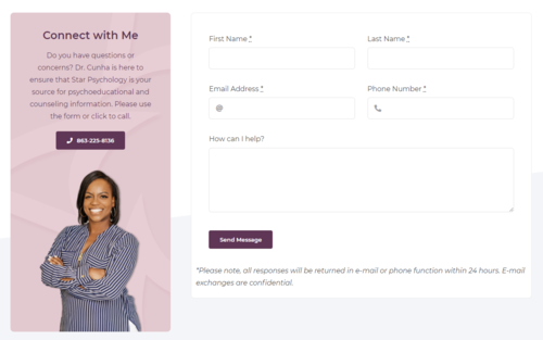
It’s easy to assume that you want as detailed and comprehensive of a contact form as possible. After all, communication via electronic means like email can often leave plenty of room for confusion, misunderstood statements or bad first impressions if only because of the way you type. If you can cover every single base possible by having customers/clients answering 20 to 30 questions in order for you to answer their one question, that will start things off great! … Except not really. Complicated forms or asking for too much information just to send something to your business is an easy turn-off for lots of people, which usually means they won’t bother to even try as they head out and never look back. Worst yet, your visitors could be having a hard time finding your contact page in the first place! Let’s talk about that.
Don’t think of your contact page as an application for a job. You want people spending as little time as possible on this particular part of your website, if only to continue looking at the other, much more informative sections. Every field is different, and as such, you can’t always get away with the goal of a form that takes someone less than a minute to fill out. The end goal doesn’t change, however: the reason WHY you have a website is for people to be able to reach you. This is how you obtain new business, and while it’s very important to understand your client, you can always delve into the details at a later time. It’s a good idea to consider just requesting their first/last name, email and/or phone number with an option to send a message to open the doors into something deeper. You know you have their interest if they’re bothering to contact you in the first place. Schedule a time to talk to them over the phone to get the detail-oriented information out of the way. Trust me, you’ll attract more bees than flies with that kind of honey-like approach.
you need to always make a connection
There are far too many websites out there — yes, even for that very niche, one-of-a-kind market you think you’ve conquered — to compete against, and you likely can’t afford to let yourself look like all of the others. Why would you want to anyway!? You need to make an active effort to stand out and ensure your business and brand is what sticks with a potential client. There are plenty of… erm, interesting design choices you can make to do that, but you want to be memorable for all of the right reasons and none of the bad.
Consider removing the stock photos you’re using to fill your web pages and replace it with items from your own brand. You might need to spend some cash to get professional photography, but it’s well worth it in the end to show off your pride and joy. Speaking of pride and joy, don’t be insistent about keeping your face off of the internet! Get some headshots taken while you’re at it; show you’re easy to approach even if you might not feel that way, because that’s the kind of feeling you want in visitors looking through you and 5 of your competitors to see who they want to reach out to.
Did you know that your “About” page is the most visited page after landing on your website in the first place? It goes beyond some well-edited and posed photos to make sure you’re creating the kind of connection you’re wanting to build with people you don’t know. Your personality needs to show in everything you do, from the way you type to the colors you decide to use. Every little detail matters! Your “selling” phase begins long before your prospects decide to initiate a conversation with you
find a balance between too much and too little
It’s true that most visitors will leave your website in a handful of seconds if their first impression isn’t a good one. If you have a busy landing page with too many distracting colors, images and fonts, or your site is crammed with so much content that it takes forever to load? I hate to be the bearer of bad news, but things aren’t going to look great. On the flip side, minimalism is a very trendy style that a lot of business owners have jumped on. If done successfully and if it matches your brand, that might be your style! More often than not, though, you’ll end up leaving your visitors with more questions than answers. That might be good for your favorite philosophical novel, but maybe not for a website that is supposed to appeal to the average customer.
If your brand image hasn’t been strategized appropriately, you could be dealing with a situation where your website is too confusing. Common mistakes are inconsistent changes from page to page, up to and including different fonts, color palettes and overall themes. Business owners trying to tackle their first website can often find themselves wanting too many things in their overeagerness, resulting in a variety of design templates being used that have no affiliation with one another. Fortunately enough, things like typeface and colors can be fixed by simply deciding on what you like most and sticking with it from beginning to end.
Consider your content very carefully and do your best balancing act. Make every word count. Keeping it from feeling bloated will avoid overwhelming your readers, and ensuring your website is more than a photo gallery with a few quotes will help them understand you more. You want them to commit to a decision that involves getting in contact with you, and you want them to do it as quickly as possible. Us human beings aren’t well known for long-term attention spans!
if you found any of these errors on your webpage, don’t fret!
The first step is acknowledging it, and we marked that off together. So why don’t we continue to work as a team to help you build the perfect brand that encapsulates everything that makes you you? You can take my advice and do plenty of things on your own, but crafting an image and maintaining it over not only a website but every digital part of you can be a tough piece of meat to chew on. Let’s have a chat about how I can help you do that!